Tuesday, December 13, 2011
Monday, December 12, 2011
Monday, December 5, 2011
Friday, December 2, 2011
Monday, November 28, 2011
Consumerism & The Advertising Industry
Adbusters Spoof Ads
Designing Your Spoof Ad
Spoof Ad Assignment- you are to design a magazine cover and/or an ad that pokes fun at something to do with the media. It could be something we went over in class together ie. body image, consumerism, exploitation, branding, or think of something that you are concerned about. You can work together in pairs (do both cover and ad), or solo (choose either).
Brainstorm Ideas: First find 5 adds that are not really selling the product that is on the ad, post them to your blog. Then you are to bainstorm ideas based on Adbusters criteria. Decide what is your message, Identify your audience, figure out the image and play with the text.
I don't get why this pepsi ad needed a picture of a couple with dogs. It seems more suitable for fashion magazine or even family magazine.
The props like cell phone on the left and keys on the right are very distracting.
They sort of ruin the focus of the entire ad.
It is hard to tell whether it is a perfume ad or a gum ad.
I think placing a naked woman's picture is just too abrupt and the text could be improved.
This one seems better than the other ad above but still, I don't see the point of placing a couple for perfume ad, especially full bodies of them. I guess it could make more sense if it was a closed up picture of a couple.
Tuesday, November 15, 2011
Monday, November 7, 2011
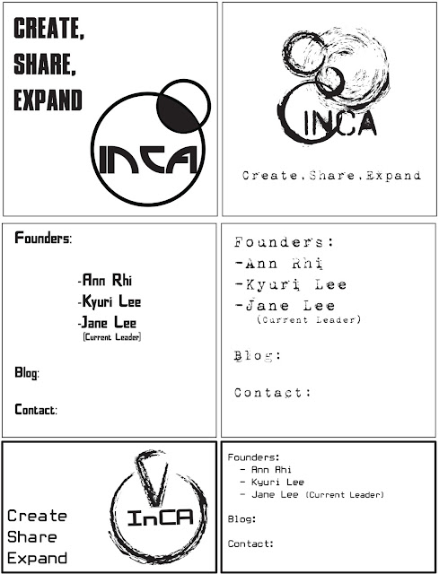
Business Card
1. Bilateral 2. Dilational
3. Radial 4. Grid
5. Modular + Transitional 6. Random
7. Axial 8. Random
9. Bilateral 10. Random
3 Best Selections
Tuesday, October 25, 2011
Helvetica in Life
HELVETICA IS SIMPLY EVERYWHERE!
By watching the documentary, I realized how we are all close and familar with Helvetica.
Although I knew that Helvetica was overused, I felt that depending on the uses of Helvetica, they all had different feelings and connotation to it, so that was why I didn't take it seriously when people were saying Helvetica makes them sick.
But after watching the documentary, I felt that people wanted to stay in "safe zone" by using the font that is widely accepted and used.
Now I think that people should start adopting new, innovative fonts that are not necessarily too distracting or unclear to the level which people have hard time reading and understanding it. The new fonts can be just as clear as Helvetica but it can bring out much fresh, new feelings.
Monday, October 24, 2011
Friday, October 14, 2011
Monday, October 3, 2011
Subscribe to:
Comments (Atom)


